![MacBook Pro.png](https://static.wixstatic.com/media/99c97e_03c3f7bfb62c41dca3d3b63820498a84~mv2.png/v1/fill/w_644,h_374,al_c,q_85,usm_0.66_1.00_0.01,enc_avif,quality_auto/MacBook%20Pro.png)
![iPad Air 4.png](https://static.wixstatic.com/media/99c97e_d4159fedf853402e840da8495c853ae4~mv2.png/v1/fill/w_410,h_298,al_c,q_85,usm_0.66_1.00_0.01,enc_avif,quality_auto/iPad%20Air%204.png)
ABOUT TEETHEN
This is a designathon submission by
PROBLEM
Dentists are always busy dealing with patients and want to spend less time doing administrative task.
GOAL
Giving the best clinical care for patient and organizing their profiles efficiently by providing an good software suitable for all dental cases.
MY ROLE
UX designer, UX researcher, UI designer
RESPONSIBILITIES
User research, Wireframing and Prototyping
WHAT DID WE DO?
![Common Template.png](https://static.wixstatic.com/media/99c97e_7a43f139aaaf4c43a7da5bf5deaf45f1~mv2.png/v1/fill/w_1010,h_498,al_c,q_90,usm_0.66_1.00_0.01,enc_avif,quality_auto/Common%20Template.png)
USER RESEARCH : SUMMARY
Dentists rely on technology on a daily basis. For example, they need to when leveraging hardware to X-ray and analyze the makeup of their patients’ mouths when creating a treatment plan. Dentists, like other health care professionals, are also strapped for time. They’re always looking for ways to optimize processes, reduce wait time, and spend less time on manual administrative work.
PAIN POINTS
Not enough time to spend on administrative work
Very complicated interface for non-tech people so it needs training
Not suitable softwares available for different cases like orthodontics and implants
USER PERSONAS
![Capture.JPG](https://static.wixstatic.com/media/99c97e_61b0d0f5dc444ae893f60c0822083f0e~mv2.jpg/v1/fill/w_890,h_498,al_c,q_85,usm_0.66_1.00_0.01,enc_avif,quality_auto/Capture_JPG.jpg)
![Capture_2_PERSONA.JPG](https://static.wixstatic.com/media/99c97e_8f833f1d0dfe40cab6a7a69ff6206538~mv2.jpg/v1/fill/w_854,h_476,al_c,q_85,usm_0.66_1.00_0.01,enc_avif,quality_auto/Capture_2_PERSONA_JPG.jpg)
USER JOURNEY MAP
![USER JOURNEY MAP.JPG](https://static.wixstatic.com/media/99c97e_dbf2de9abd3d4d1ab53369f89e9c8c3f~mv2.jpg/v1/crop/x_10,y_13,w_1462,h_715/fill/w_887,h_434,al_c,q_85,usm_0.66_1.00_0.01,enc_avif,quality_auto/USER%20JOURNEY%20MAP_JPG.jpg)
FROM SKETCHES TO LOW FIDELITY PROTOTYPE
PAPER WIREFRAMES
![Capture.JPG](https://static.wixstatic.com/media/99c97e_5f4f24615d4142e09fed2750bc0414c6~mv2.jpg/v1/fill/w_309,h_478,al_c,q_80,usm_0.66_1.00_0.01,enc_avif,quality_auto/Capture_JPG.jpg)
![2.JPG](https://static.wixstatic.com/media/99c97e_1ff7dbd8ab024176a2b133c46a895d14~mv2.jpg/v1/fill/w_347,h_478,al_c,q_80,usm_0.66_1.00_0.01,enc_avif,quality_auto/2_JPG.jpg)
![3.JPG](https://static.wixstatic.com/media/99c97e_50aae1e4600747a2a978c3f82fe78d3c~mv2.jpg/v1/fill/w_318,h_478,al_c,q_80,usm_0.66_1.00_0.01,enc_avif,quality_auto/3_JPG.jpg)
LOW FIDELITY PROTOTYPE
![Low 1.JPG](https://static.wixstatic.com/media/99c97e_060d8a9883484414a2b34efaf2e5080e~mv2.jpg/v1/fill/w_894,h_503,al_c,q_85,usm_0.66_1.00_0.01,enc_avif,quality_auto/Low%201_JPG.jpg)
![Low 2.JPG](https://static.wixstatic.com/media/99c97e_902116eda3cf4281bc1e38f8a97aff5c~mv2.jpg/v1/fill/w_902,h_500,al_c,q_85,usm_0.66_1.00_0.01,enc_avif,quality_auto/Low%202_JPG.jpg)
USABILITY STUDY : FINDINGS
I conducted two rounds of usability studies. Findings from the first study helped in guiding the designs from wireframes to mockup. The second study used a high fidelity prototype and revealed what aspects of the mockup needed refining.
![RND1.JPG](https://static.wixstatic.com/media/99c97e_e161fdcbeef64a3cb04fee29d3e3e8c4~mv2.jpg/v1/crop/x_0,y_0,w_653,h_392/fill/w_523,h_314,al_c,q_80,usm_0.66_1.00_0.01,enc_avif,quality_auto/RND1_JPG.jpg)
![RND 2.JPG](https://static.wixstatic.com/media/99c97e_b0006766fb2640ecbcdcf58ad6cba91a~mv2.jpg/v1/fill/w_507,h_349,al_c,q_80,usm_0.66_1.00_0.01,enc_avif,quality_auto/RND%202_JPG.jpg)
HIGH FIDELITY PROTOTYPE
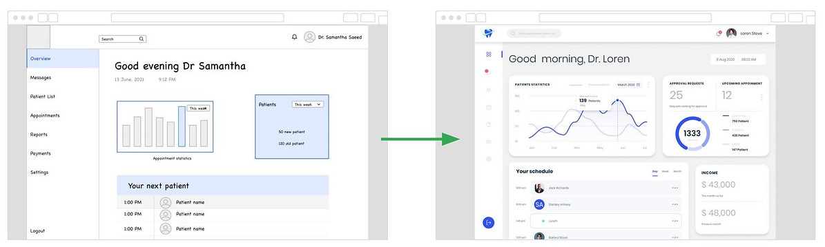
The first usability study showed that the graphical data analysis should be more attractive and easy to understand, also the user needed to know his monthly income and number of patients till now.
![M1.JPG](https://static.wixstatic.com/media/99c97e_21e5372f56cb47838646e67466bebbc3~mv2.jpg/v1/crop/x_0,y_0,w_1669,h_508/fill/w_1176,h_358,al_c,q_85,usm_0.66_1.00_0.01,enc_avif,quality_auto/M1_JPG.jpg)
![M2.JPG](https://static.wixstatic.com/media/99c97e_b9e084adba6b4baf9bd4964914ded8e2~mv2.jpg/v1/fill/w_1195,h_435,al_c,q_85,usm_0.66_1.00_0.01,enc_avif,quality_auto/M2_JPG.jpg)
![M3.JPG](https://static.wixstatic.com/media/99c97e_619d1994c3c34c37b67482f54a0159ff~mv2.jpg/v1/fill/w_1177,h_430,al_c,q_85,usm_0.66_1.00_0.01,enc_avif,quality_auto/M3_JPG.jpg)
Click here for Teethen High Fidelity Prototype link
ACCESSIBILITY CONSIDERATION
Using eye friendly color pallet to serve eye blindness
Provided clear and consistent navigation supported by icons to support vision impaired users
Adding text to images for screen reader
REFLECTIONS
While designing Teethen's app, I learned how to iterate on a design and continually improve it based on research and feedback. I learned to think broadly to remove inherent biases in my design.